Alright, so here’s the thing. We ALLLLLLL love to flaunt our babies like it’s nobody’s business… but seriously; it’s nobody’s business. So, Lesson One in taking fabulous photos on your phone worthy of sharing with the world: don’t overdo it. Less is more. Check yourself before you wreck yourself. STOP.
There’s gotta be more to your feed than just your angel (as sweet as they may be) because after all, you ARE your own woman, correct?! Let that come through. All this aside – because I literally am NOT going to get into the specifics of curating an Instagram feed right now – here are my personal tips on mastering the art of whipping out your phone and capturing a moment you will cherish forever, and may even want to print into a book one day. (P.S. there’s an app for that).
Oh and before we get right into it, do yourself a favour and upgrade to a phone that has a kick ass camera because let’s face it, your 6 year old Blackberry won’t cut it. I use a Samsung Edge and might as well be an ambassador for it because it’s thebomb.com but really, any recent smartphone will do.
Whip it Out
Don’t just wait till your kid is at the birthday party to take a shot of her in her princess dress, it’s the everyday moments that are the most beautiful, so bust that phone out, often. I make a point to take photos every single day even if we’re just out loitering the streets on a daily walk. Make your own photo ops.
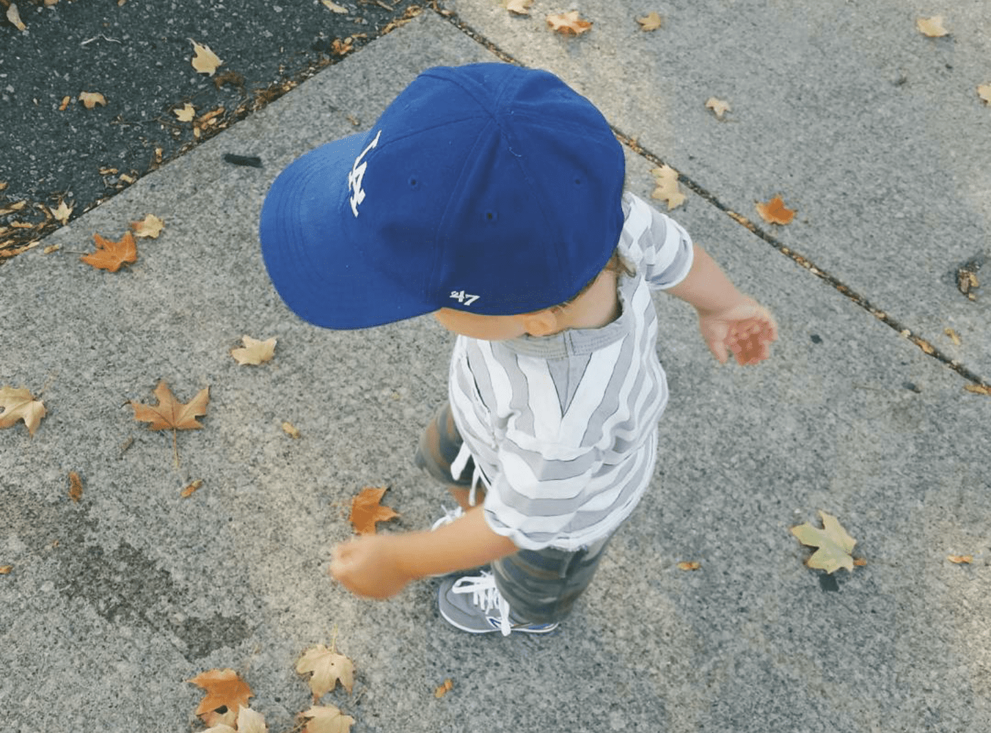
The Rule of Thirds
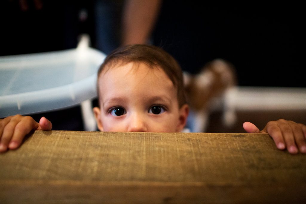
This is a basic composition principle in photography that naturally looks and feels right to the human eye, making it an automatic aesthetic winner. In short, make the subject of the pic (i.e. your snot nosed miracle child) align on the grid lines if you were to invisibly split the photo in thirds. If you’re up close and personal, the rule can still apply and I find is most effective when it lands on the eyes.
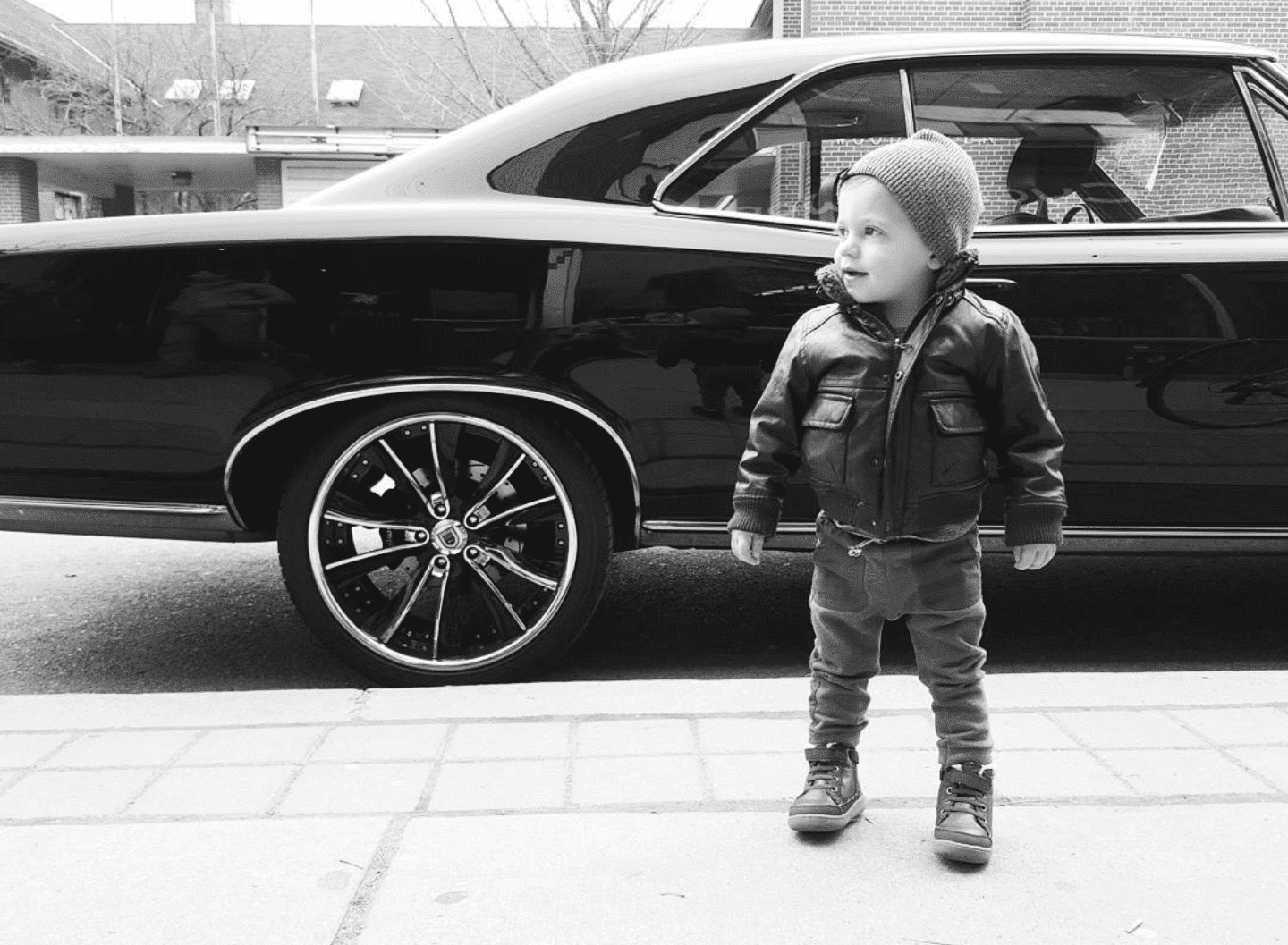
Cropping
Obviously, positioning a kid can be challenging (understatement of the year), and that’s where cropping comes in handy. This, for me, is the be-all, end-all and if I had only one tool to use, this wins hands down. The positioning literally makes or breaks a photo so if you don’t get your kid in the right part of the pic, crop it and make it happen later.
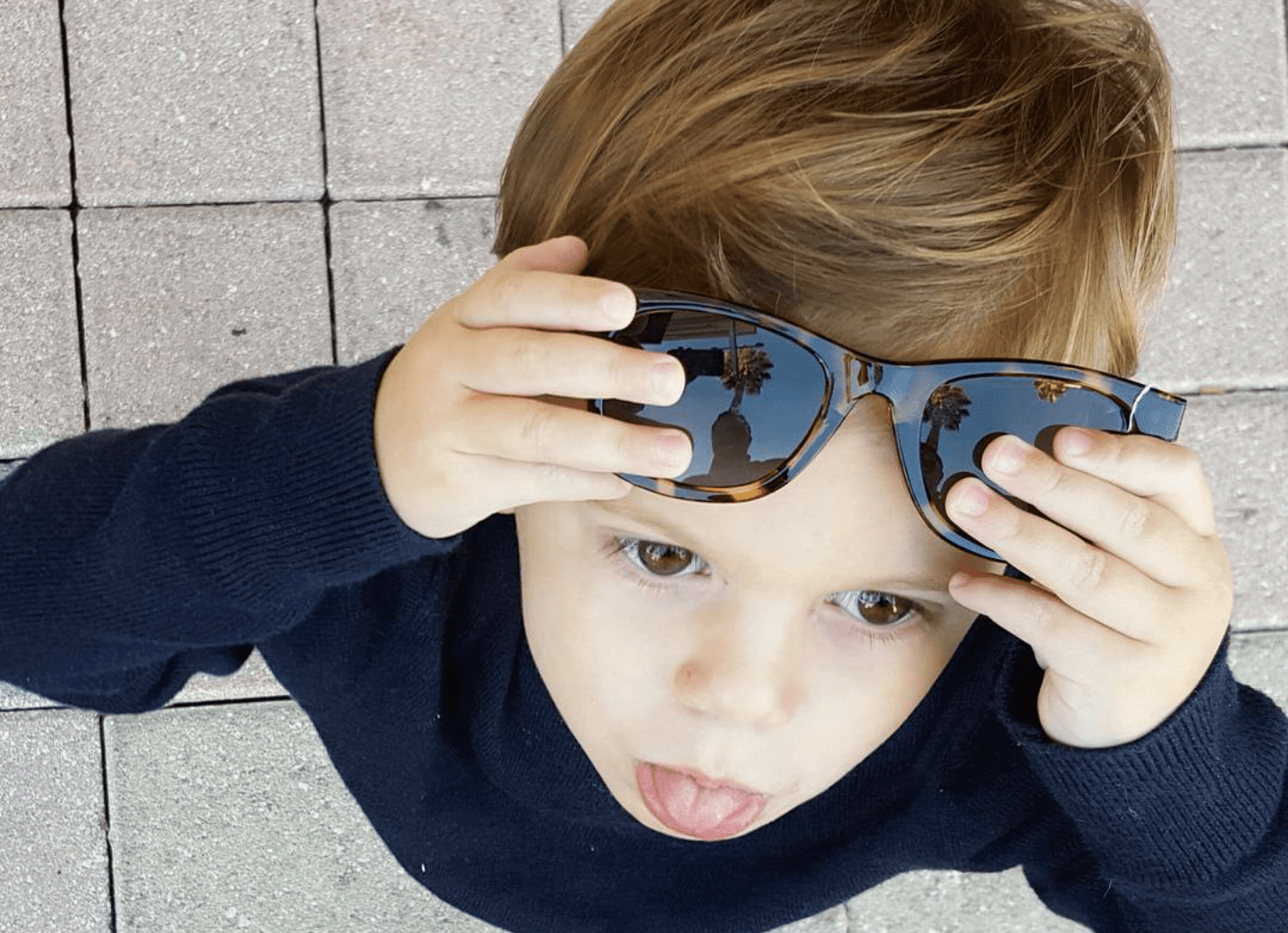
K.I.S.S.
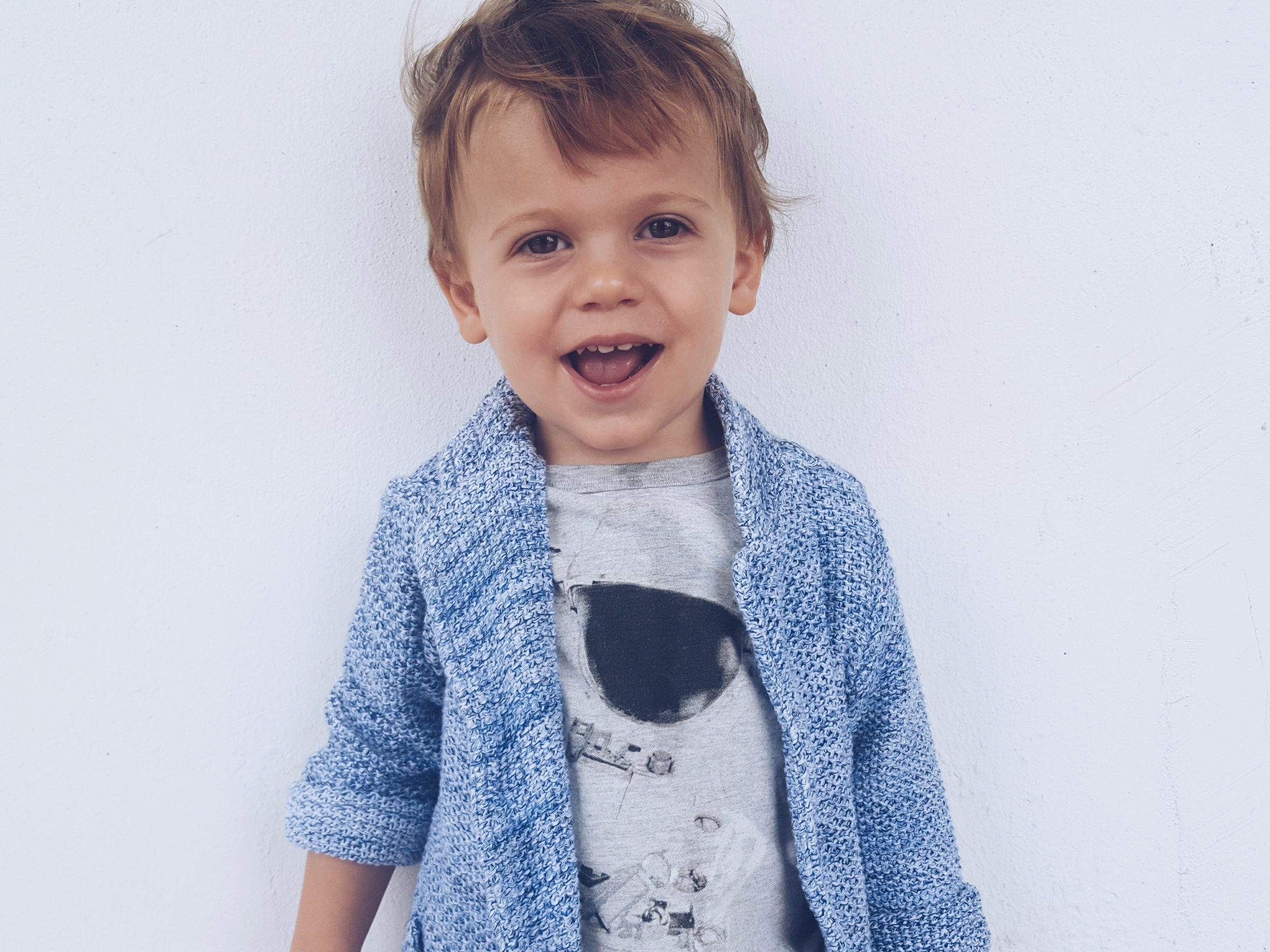
Yep, that old acronym is still true. Keep It Simple, Stupid. When the photo is calm and the focus is clear (ie: you’re focused on the child and not the clusterfuck mess behind them) the images will bring a feeling of harmony and sophistication. And what mama doesn’t want to look like she’s got her shit under control?! I always, ALWAYS search out a white wall. Don’t worry about empty space, it will only make your subject stand out more.
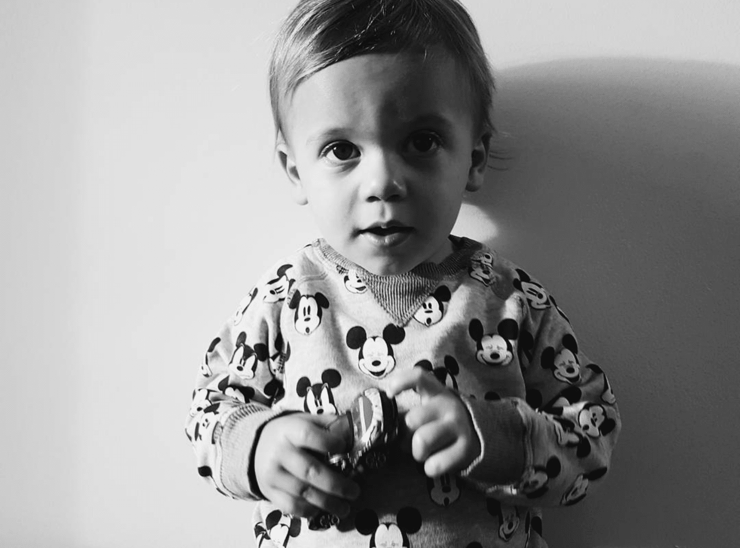
Work that Angle
I generally try the same photo in a few different angles (my son just loves that whole paparazzi vibe) because it can really make a photo unique and more memorable when you catch it from a different side. In the case of children being the subjects, I love getting down to their level and making the photo really feel like you’re getting a sneak peak into their little world.

Get Up Close and Personal
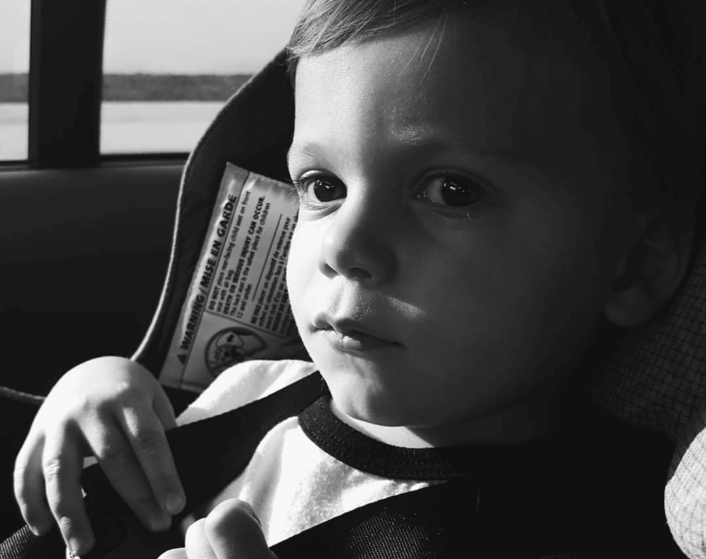
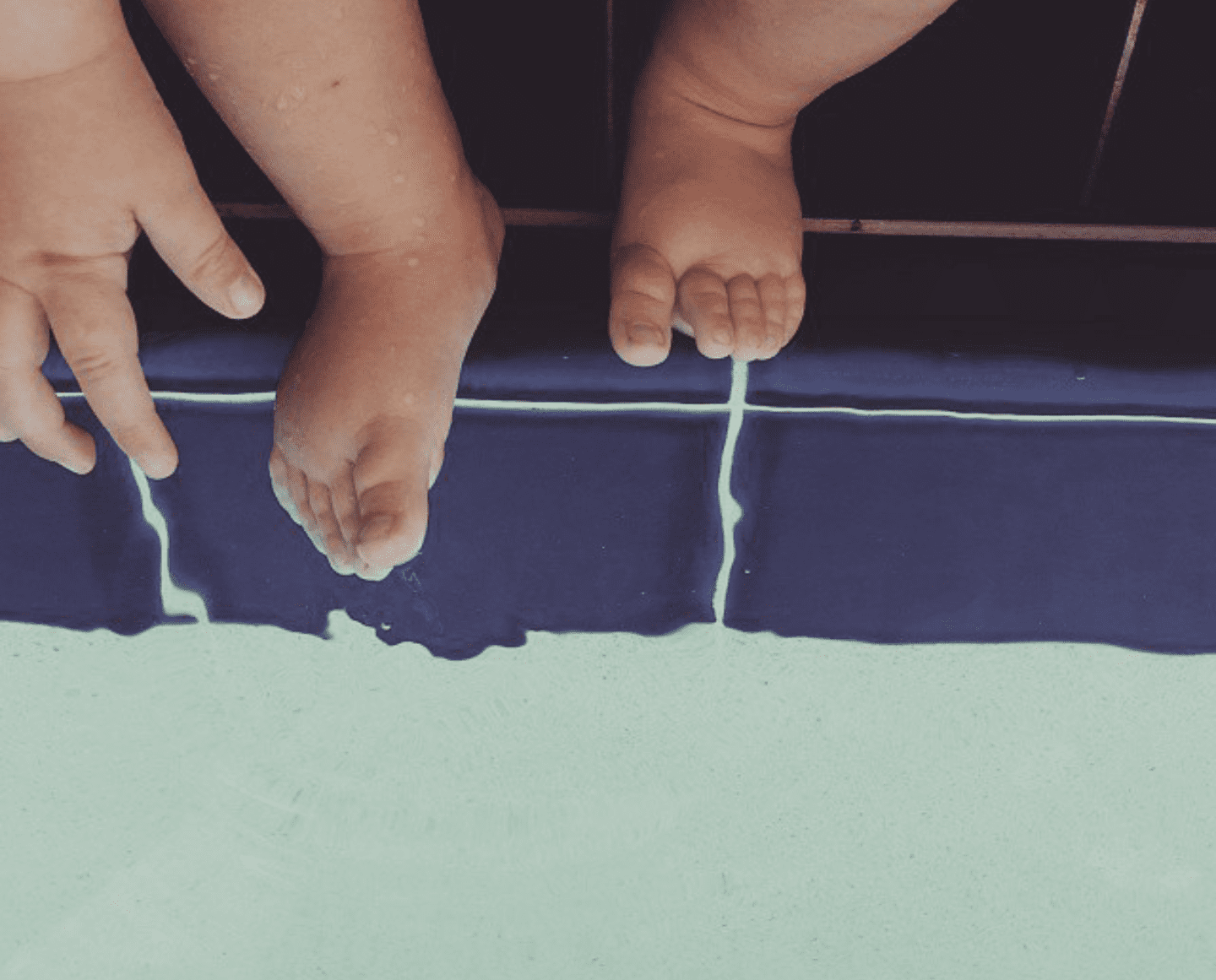
I’m a huge fan of close ups because children are so damn pure and beautiful and if you can catch even a glimmer of that in a photo you will fall in love with it over and over again. And let’s be real, you want to marvel over that baby skin forever. *Take note: this doesn’t pertain to the face only – get their little fingers and toes in there too for details that matter.
And a little Shady
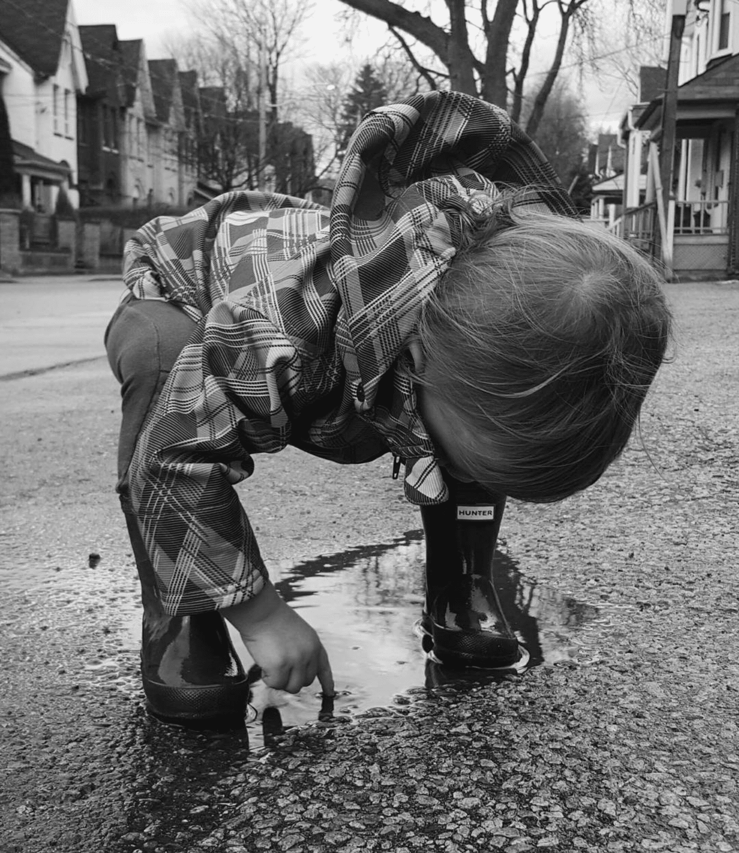
When there’s an opportunity to use shadow, do it. I find it automatically creates a little romanticism, elegance and is very striking in black and white. Trés chic my friends, trés chic.
Use Shapes Creatively
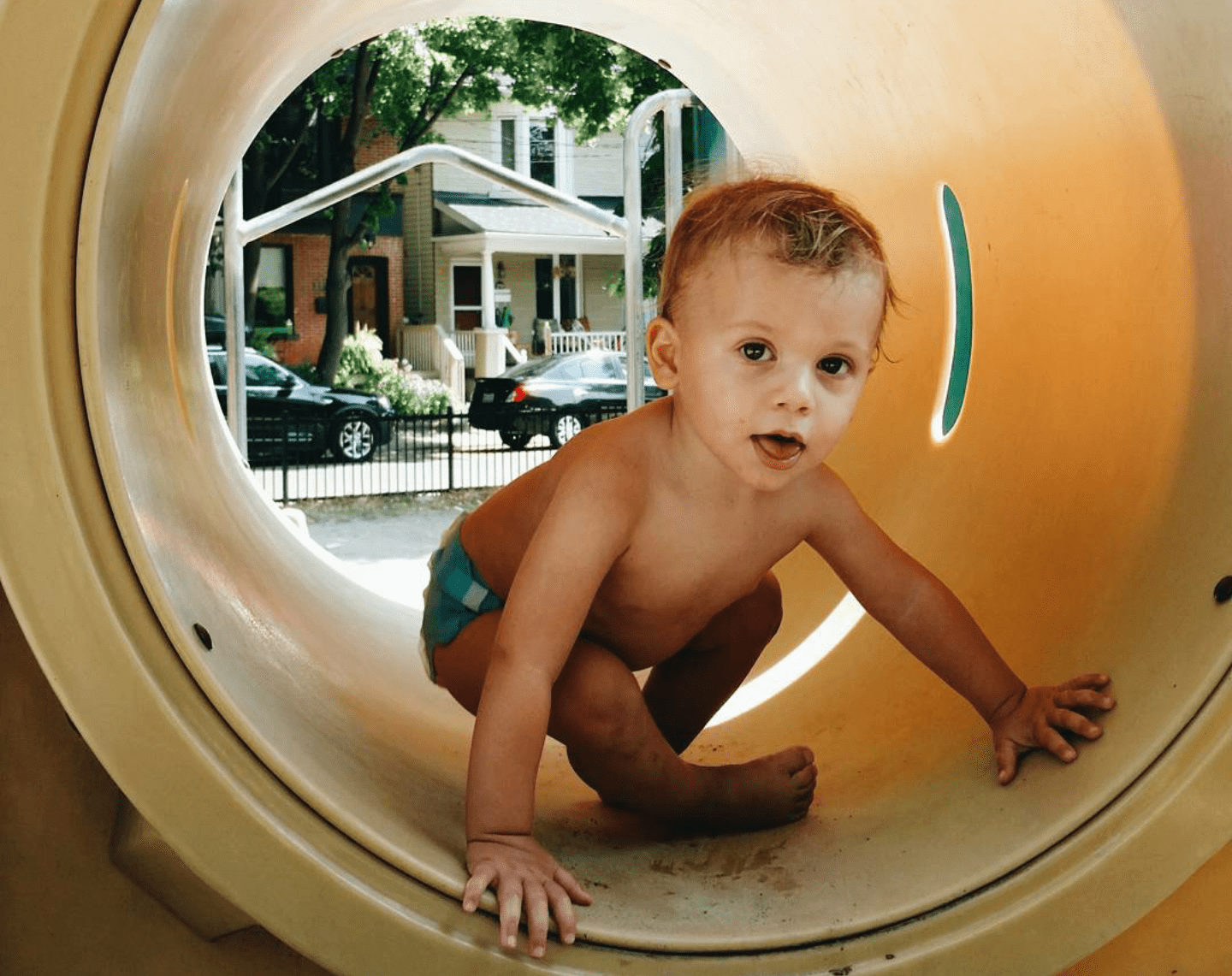
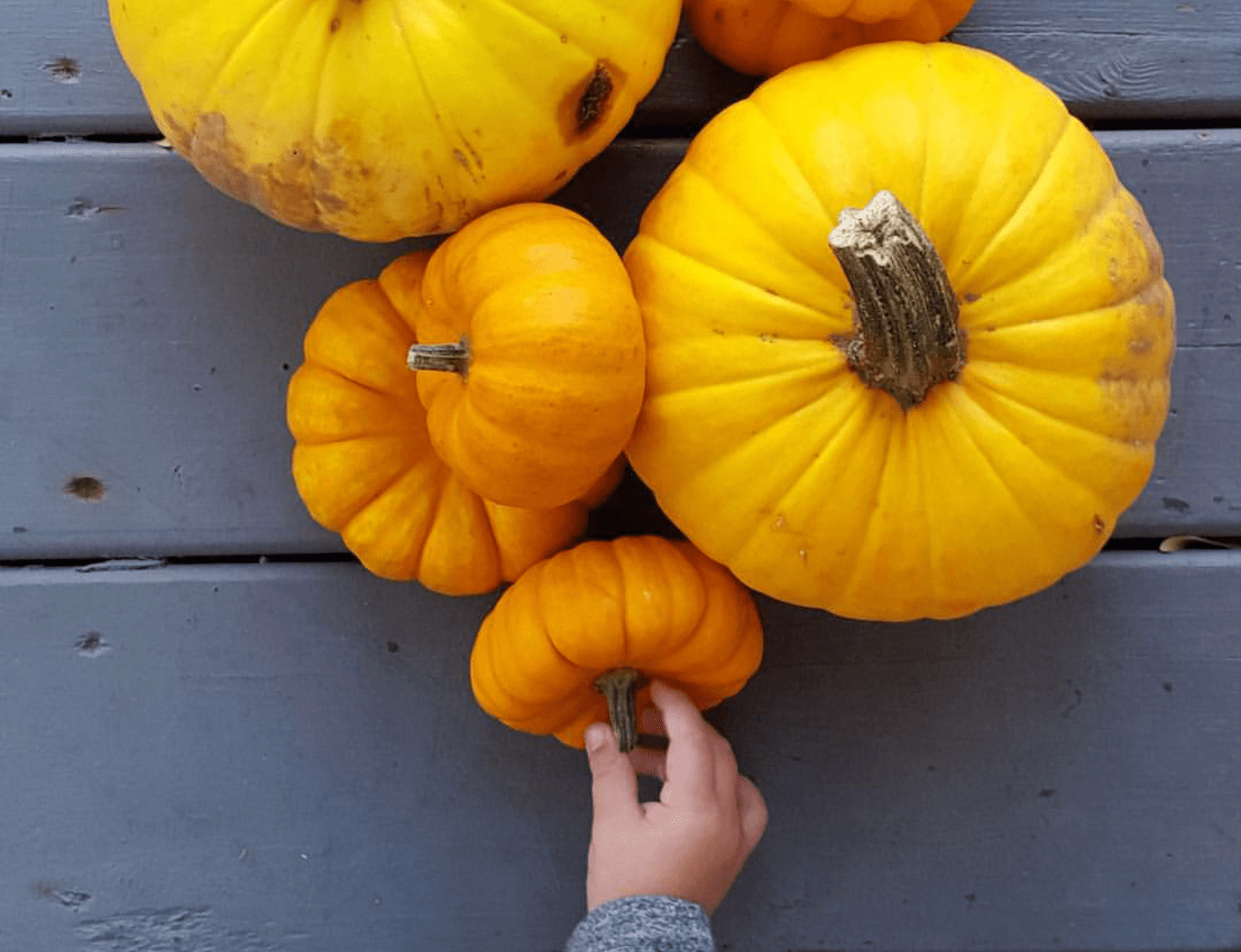
At the playground? Use the shapes and colours to your advantage and make them stand out in a unique way. We’ve already seen 500 photos of kids at the top of a slide, try something different and you may end up with something much more powerful.
Embrace Movement
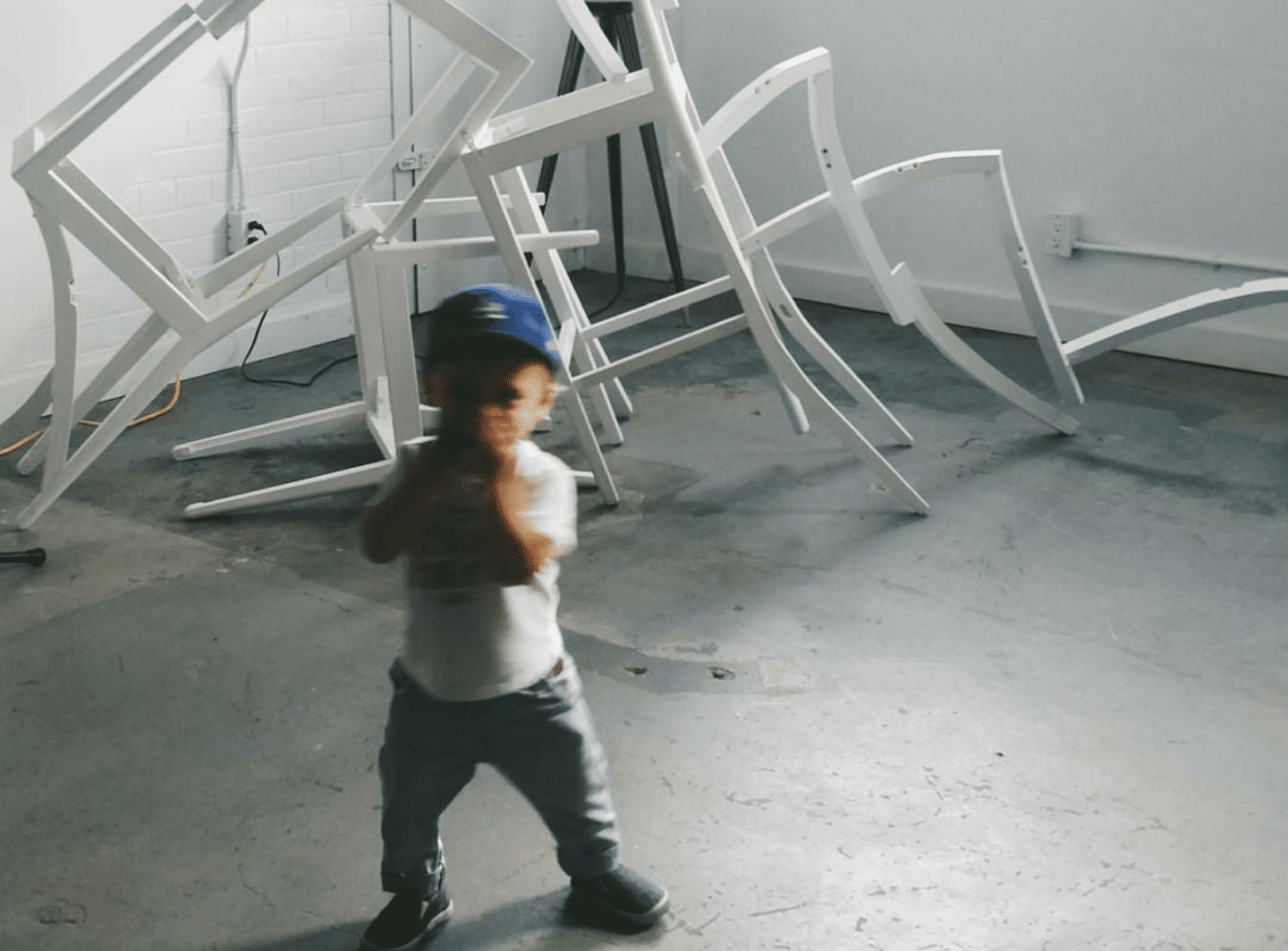
Although most times we wait until the child STOPS effing moving for one second, sometimes a beautiful blur can add to the feeling of that capture, making it a fun, in-the-moment and super artsy snap.
Silhouette Silhouette Silhouette
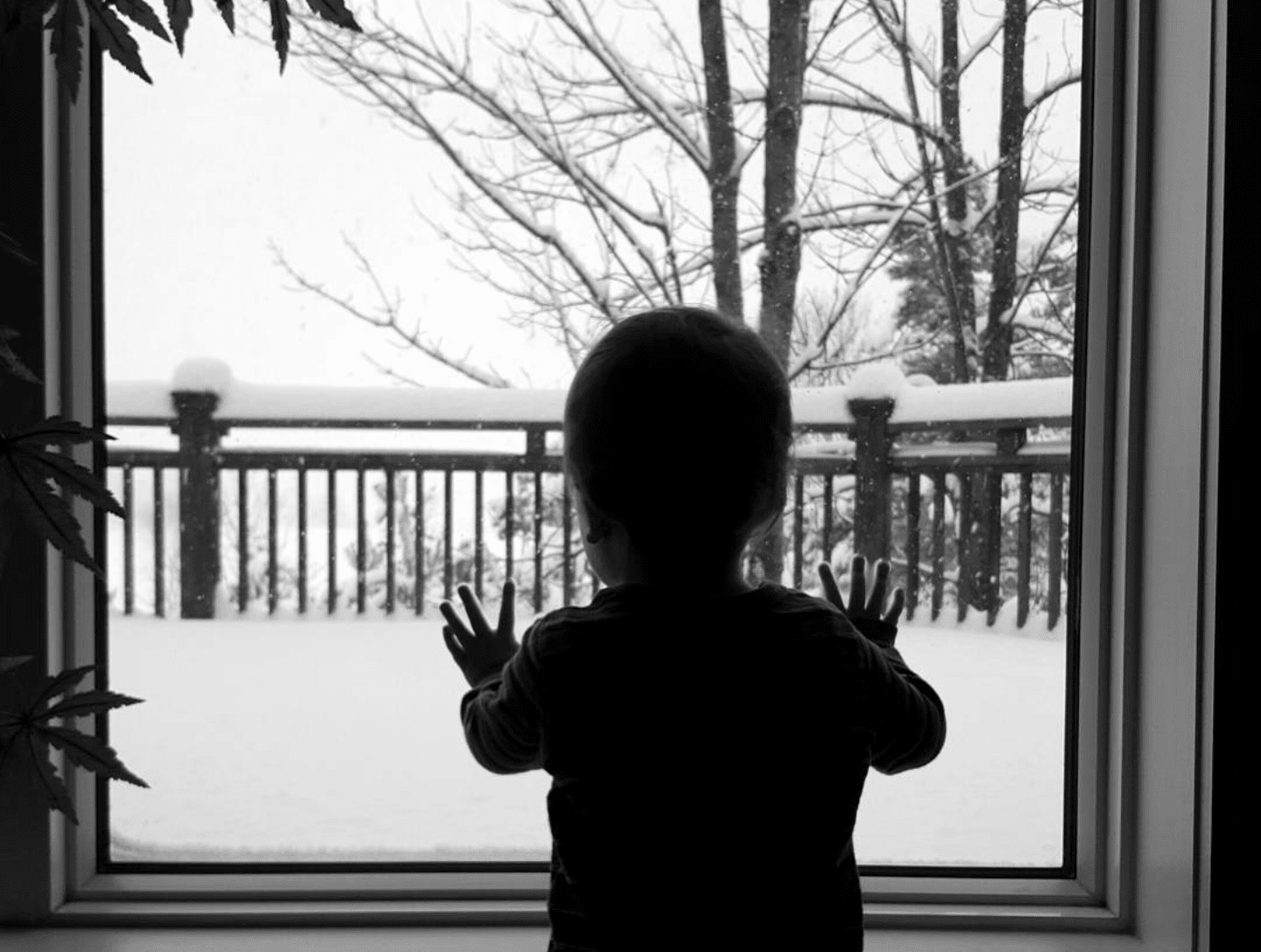
When you shoot against the light and create a silhouette, it just becomes so darn poetic doesn’t it?! It’s like there’s a deep story within that photograph that not only speaks to the subject, but depicts the mood of the photographer aka mama.
Natural Lighting
EVERYTHING looks better in natural light. Granted there will be times you need to flash it up, but save those for yourself because red eyed children just look like tiny devils and that shit is scary. And use the beautiful backdrop nature provides whenever possible!
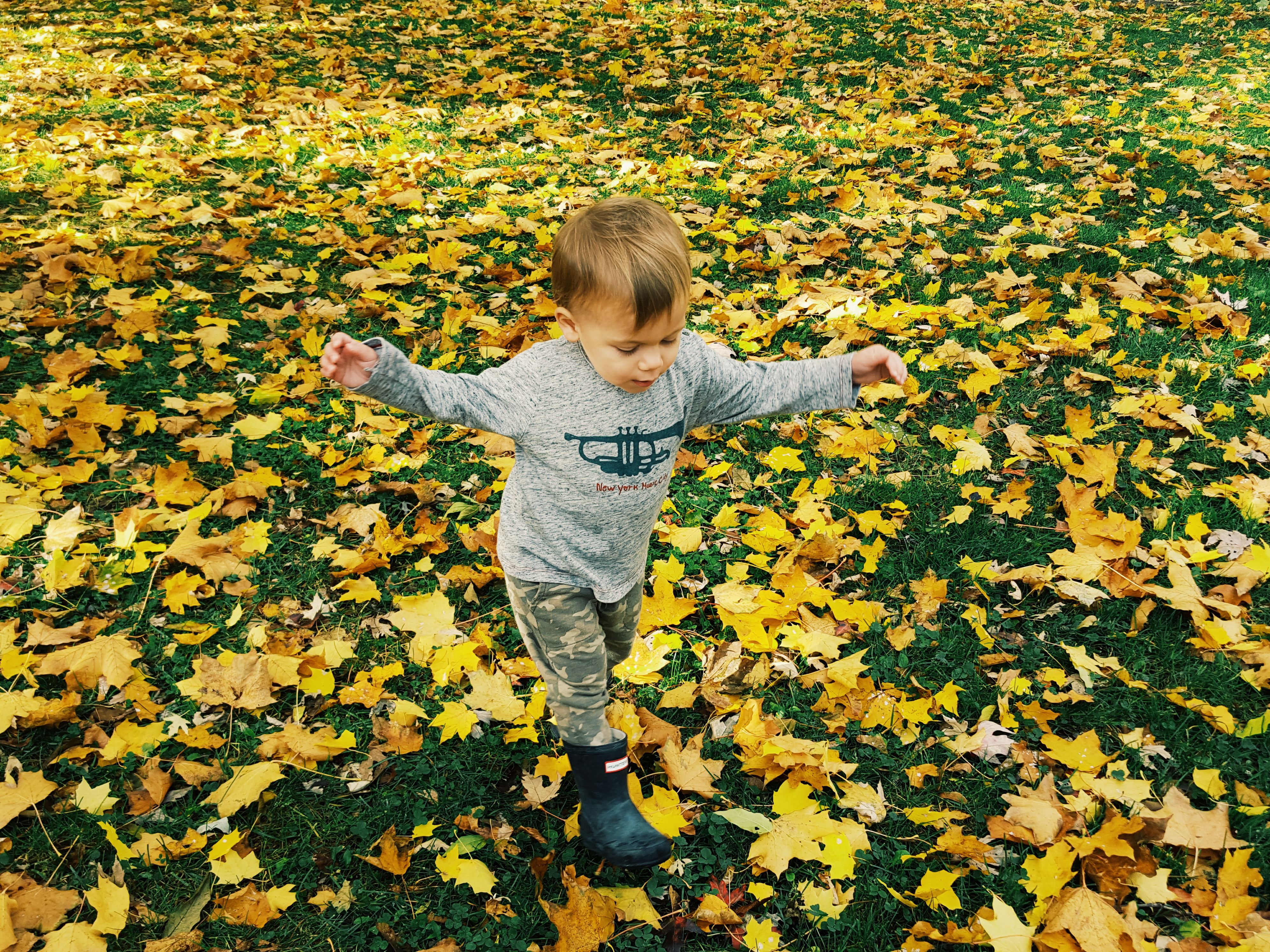
Don’t Filter Hard
I tend to think heavy filters (whether it’s from VSCO, editing tools in your phone or on social apps) just take away from the natural beauty of things. A little help is ok, but overdoing it kills the whole feel in my opinion.
When in doubt, black and white. There’s really nothing quite as classic.
Please note, by no circumstance are you using all these tips at once because that would be insane. Above all BE PATIENT; with yourself AND your mini. Lord knows you’ll have to snap a dozen pics before catching the one you love most. And my last words of advice are – DON’T BE AFRAID! EXPERIMENT! You may just create some lifelong memories right there, on your phone, as you go through the everyday hustle and bustle of being a mama… And we all know it’s those little moments that we wish we could hold onto forever.
So why not make it happen?
xx A
Connect @aleksjassem on Twitter & Instagram



From Our Comments